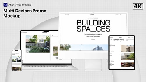
Responsive Website Display on Multi-Device 3D Mockups
By -BeCreative-One great value subscription from $16.50/month
- Unlimited downloads of 27+ million creative assets
- AI Tools: video, image and more
- Lifetime commercial license
- Easy cancellation
Already have an account? Sign in
Attributes
- Length
- 0:27
- Resolution
- 1920 x 1080
- File Size
- 1.59 GB
- Application Supported
- After Effects
- Required Plugin
- None required
- After Effects Version
- CC
- Commercial License
- Further Information
Description
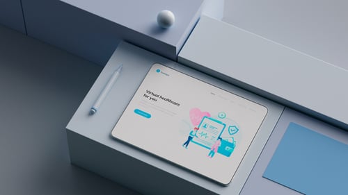
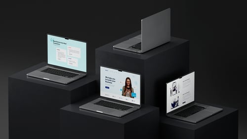
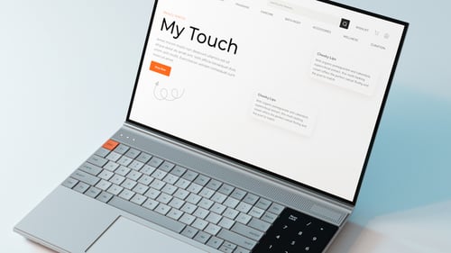
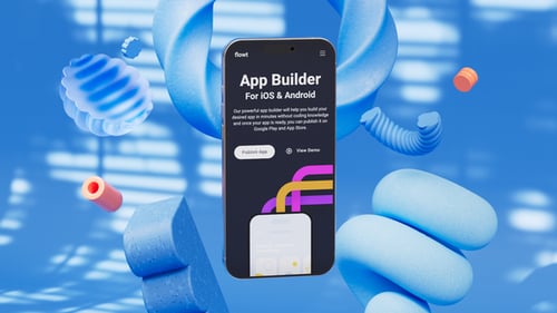
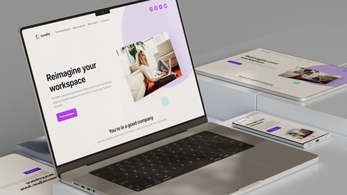
This dynamic video template offers a polished solution for showcasing responsive website or application designs. Featuring realistic 3D mockups of modern digital devices, including a tablet, smartphone, and laptop, the animation seamlessly presents how an interface adapts across different screen sizes. With smooth camera movements and clean transitions, it provides an engaging and professional visual experience. Ideal for web developers, UI/UX designers, and tech companies, this template is perfect for product presentations, marketing campaigns, or portfolio highlights, effectively demonstrating cross-device compatibility and user experience in a contemporary style.
Audio used in this item